


One good reason to use charts.
I am not a fan of technical analysis. But charts do have their place. For instance, are we closer to the top or bottom of the market?
Using the S&P 500 gives us a lot of the large cap stocks:
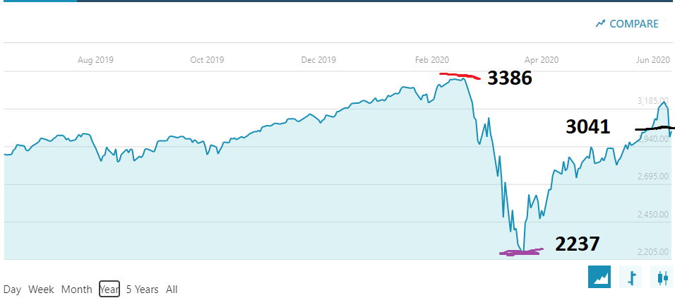
The ugly red line shows us the top of the market for the past year. (I think this is supposed to actually be red) The purple line at the bottom shows where the bottom in the market happened. The black mark shows us the close on Monday June 15. We can see that the close Monday is about one third of the way down from the top.
If we want to get technical about it, current close is 345 down from high, 806 up from bottom, so we are definitely closer to top than bottom. In fact, we are not one third down from the top, we are closer than that.
Our recent top last Wednesday close, June 10th, was not the high in the market this year. Therefor, I believe that the market could actually go higher. And since it is not the low either, it could go much lower.
I believe it is almost impossible to call the top or the bottom of the market as it happens, but you can see that we are currently somewhere between the high and the low.
Why is all of this important? If we were around the bottom of the market, we would probably want to put cash to work, buying a bit at a time (especially since there are no fees for trading right now). As we approach the top of the market, we probably want to raise more cash, understanding that there will be a downturn at some point.
I suggest raising around 30% in cash right now to be ready for the next downturn. A bigger one than last Thursday the 11th. When will it happen? Who knows, but as the market continues to go up, the more likely that the market will take a big drop.
I am not trying to scare you, I just want you to be ready for the next opportunity to buy.
Similar to looking at the market as a whole, you can look at an individual company like Facebook:
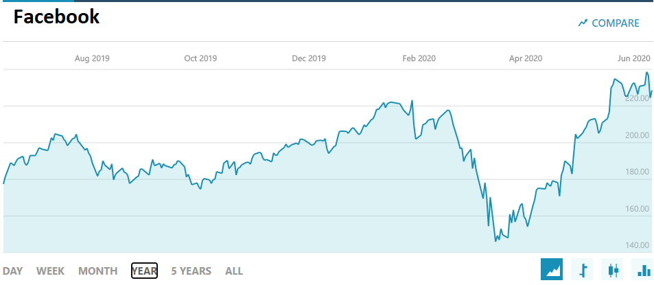
Looking at Facebook’s stock, the chart shows that it is priced right at the top of the past year. This tells us the stock may be overpriced, or not. I would not depend on the chart alone to tell me this but it is one piece of evidence.
As far as the remainder of technical analysis, I’ll leave that to somebody else.
More Reading: